 Women's Human Rights Institute of Korea (WHRIK)

 Submit an online counseling request regarding victimization.
Center Symbol (CI)

National Center for Digital Sexual Crime Response (NCDSCR) Logo Usage Guidelines
These guidelines govern the use of the logos of the NCDSCR and the 17 Regional Digital Sexual Crime Victim Support Centers (hereinafter collectively referred to as "the Centers"). They provide specific directions and recommendations for applying the logos when government ministries, public institutions, and local governments produce press releases and promotional materials.
To effectively and accurately convey a unified image, it is crucial to comply with these management regulations.
In particular, if proper follow-up maintenance is neglected in actual application, it may compromise brand image formation and accurate message delivery.
Logo Usage Guidelines
Korean-English Mixed Logo
Meaning of the '#' (Hashtag) Symbol: Protecting women's rights and ensuring safety in digital spaces
The ‘#’ (hashtag) is a symbolic icon of the digital age, harmonizing with the institution's goal to eradicate violence against women online.
Furthermore, the ‘#’ (hashtag) is a symbol that visually articulates the concepts of connection and unity.

-
Solidarity
The intersecting lines of the hashtag symbolize solidarity, where multiple people or organizations gather together to join forces.
-
Promise
The solid structure of the hashtag expresses firm resolve and the strength of a promise.
-
Protection
The grid shape of the hashtag evokes the image of a protective shield or safety net.
-
Connection
The hashtag is fundamentally utilized as a tool to connect people and information.
-
Trust
The stable structure of the hashtag represents the foundation of trust.
-
Bond
The intersecting lines visually represent the bonds and relationships between people.
Korean Logo
For domestic use, the basic Korean version should be used primarily.
As proportions have been adjusted according to each font shape, the font's shape, thickness, proportion, color, etc., must not be arbitrarily altered. All logo usage must involve
scaling or copying strictly based on the guideline data.

English Logo
For international use, the basic English version should be used primarily.
As proportions have been adjusted according to each font shape, the font's shape, thickness, proportion, color, etc., must not be arbitrarily altered. All logo usage must involve
scaling or copying strictly based on the guideline data.

Clear Space Guidelines
Clear Space is the minimum protective area required to maintain the logo's structural characteristics. When applied, a specific amount of space must be secured to prevent visual
intrusion by surrounding elements.
The use of secondary graphic elements within the Clear Space should be avoided; therefore, positioning the wordmark and securing the Clear Space must precede the development of
any material.

Logos of the 17 Metropolitan Cities and Provinces


















Logo Design Guidelines
Official(Signature) Colors
Official colors are one of the critical elements in forming the brand identity of the Centers.
They are also applied across various visual media to communicate the identity of the Centers.
The expression of official colors defaults to spot color printing, using the PANTONE colors specified below as the standard.
For newspapers, magazines, etc., that require reproduction using the four-color (CMYK) process, spot colors cannot be used, so the four-color process guidelines below should be
applied.
-
PANTONE 109C
CMYK 0 / 25 / 95 / 0
RGB 255 / 200 / 0
-
PANTONE 165C
CMYK 0 / 70 / 100 / 0
RGB 255 / 110 / 0
-
PANTONE 2369C
CMYK 85 / 80 / 0 / 0
RGB 60 / 65 / 170
-
K 60%
-
K 80%
Designated Korean and English Fonts
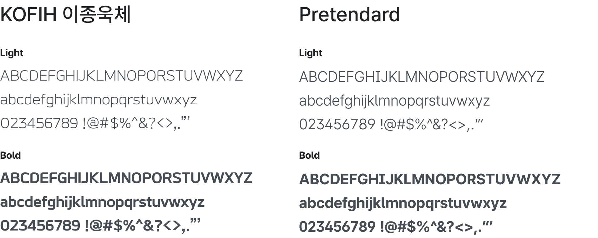
The designated brand fonts have been selected to harmonize with the brand mark for consistent identity expression.
They must be used consistently in the production of all promotional materials and internal documents.
The basic fonts used are KOFIH Lee Jong-wook (Korean) and Pretendard (English).
These fonts are provided under a license that allows free use and redistribution for all users, including individuals and corporations.
Background Color Usage Guidelines
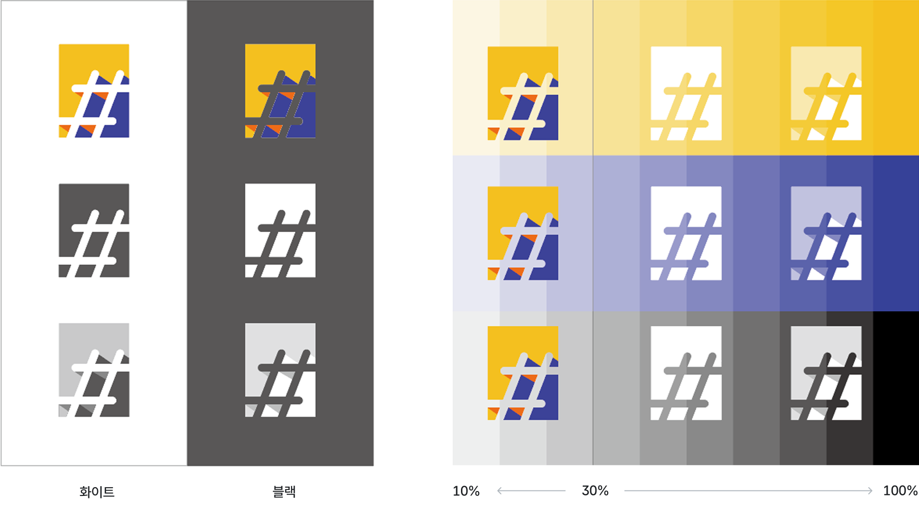
The background color usage guidelines illustrate the graphic environments where the Centers' logos can be applied over a background color. To prevent the Centers' logos from being compromised by color misuse, the following guidelines must be strictly observed, and the visual clarity of the logo must be maintained at all times.





※ Prohibited Usage: Cases where the symbol is invisible because the background color and symbol color are identical, cases where the logo is not sufficiently visible against the background color.
Background Color Usage Guidelines (Solid Color)
The background color application guidelines illustrate the graphic environments where the Centers' logos can be applied over a background color. To prevent the Centers' image from being compromised by color misuse, the following guidelines must be strictly observed, and the visual clarity of the logo must be maintained at all times.
Prohibited Usage Guidelines
The modified use of the original shape or colors of the Centers' logos requires careful attention, as it distorts the image or hinders communication effectiveness.
The examples below illustrate prohibited usages; the regulations in these guidelines must be strictly observed.
The logo must always be applied in a manner that sufficiently secures its visual clarity.
-
Arbitrarily stretched or distorted
-
Size arbitrarily changed

-
Tilt arbitrarily changed

-
Symbol color arbitrarily changed

-
Logo color arbitrarily changed

-
Logo processed with a gradient

-
Shadow effects applied

-
Arbitrary clipping mask applied to the logo

-
Used on a complex pattern background
